CSS (Cascading Style Sheets) is a style sheet language used to describe the presentation of a document written in HTML. CSS separates content from design, allowing developers to control layout, colors, fonts, and other visual aspects of web pages.
| Benefit | Description |
|---|
| Separation of concerns | Keeps content (HTML) separate from presentation (CSS) |
| Consistency | Ensures uniform styling across multiple pages |
| Performance | Improves page load times through caching |
| Accessibility | Enhances site usability for diverse users |
| Responsiveness | Enables adaptive layouts for different devices |
CSS works by selecting HTML elements and applying styles to them. The browser reads the HTML document first, creates the Document Object Model (DOM), then applies CSS rules to elements in the DOM.
<p style="color: red; font-size: 16px;">This text is red and 16px.</p>
<head>
  <style>
    p {
      color: blue;
      font-size: 14px;
    }
  </style>
</head>
HTML file:
<head>
  <link rel="stylesheet" href="styles.css" />
</head>
styles.css:
p {
  color: green;
  font-size: 18px;
}
| Method | Pros | Cons |
|---|
| Inline | Immediate application | Mixes content and presentation; Not reusable |
| Internal | No extra files | Increases page size; Not cacheable |
| External | Separation of concerns; Cacheable | Extra HTTP request |
selector {
  property: value;
  another-property: value;
}
Example:
h1 {
  color: purple;
  font-size: 24px;
  margin-bottom: 10px;
}
Selectors allow us to target specific HTML elements for styling. They're the bridge between HTML and CSS rules.
| Selector Type | Syntax | Example | Description |
|---|
| Element | element | p { color: blue; } | Targets all instances of an element |
| Class | .classname | .important { font-weight: bold; } | Targets elements with specific class |
| ID | #idname | #header { background: #333; } | Targets element with specific ID |
| Descendant | ancestor descendant | article p { font-style: italic; } | Targets descendants |
| Child | parent > child | ul > li { list-style: square; } | Targets direct children only |
| Adjacent Sibling | element + element | h2 + p { text-indent: 20px; } | Targets adjacent sibling |
| General Sibling | element ~ element | h3 ~ p { color: gray; } | Targets all following siblings |
/* Descendant selector: paragraphs inside articles */
article p {
  font-style: italic;
}

/* Child selector: list items that are direct children of unordered lists */
ul > li {
  list-style-type: square;
  color: #444;
}

/* Adjacent sibling: paragraphs immediately following h2 */
h2 + p {
  text-indent: 20px;
  font-size: 1.1em;
}

/* General sibling: all paragraphs after h3 within the same parent */
h3 ~ p {
  color: gray;
  margin-left: 1rem;
}
| Selector | Example | Description |
|---|
| [attr] | [disabled] | Elements with the attribute |
| [attr="value"] | [type="checkbox"] | Elements with specific attribute value |
| [attr*="value"] | [class*="btn"] | Elements with attributes containing value |
| [attr^="value"] | [href^="https"] | Elements with attributes starting with value |
| [attr$="value"] | [src$=".jpg"] | Elements with attributes ending with value |
/* Elements with disabled attribute */
[disabled] {
  opacity: 0.5;
  cursor: not-allowed;
}

/* Input elements of type checkbox */
[type="checkbox"] {
  margin-right: 5px;
  width: 16px;
  height: 16px;
}

/* Elements with class containing "btn" */
[class*="btn"] {
  cursor: pointer;
  display: inline-block;
}

/* All links starting with https */
[href^="https"] {
  color: green;
  padding-right: 20px;
  background: url("lock-icon.svg") no-repeat right;
}

/* All images ending with .jpg */
[src$=".jpg"] {
  border: 1px solid #ddd;
  padding: 3px;
}
a:link {
  color: blue;
}
a:visited {
  color: purple;
}
a:hover {
  text-decoration: underline;
}
a:active {
  color: red;
}
li:first-child {
  font-weight: bold;
}
li:last-child {
  margin-bottom: 0;
}
tr:nth-child(even) {
  background-color: #f2f2f2;
}
p::first-line {
  font-variant: small-caps;
}
p::first-letter {
  font-size: 200%;
  float: left;
}
.note::before {
  content: "Note: ";
  font-weight: bold;
}
a::after {
  content: " ↗";
}
::selection {
  background-color: yellow;
  color: black;
}
| Selector Type | Specificity Value | Example |
|---|
| Element selectors | 1 | p { color: blue; } |
| Class, attribute, pseudo-class | 10 | .content p { color: red; } |
| ID selectors | 100 | #main .content p { color: green; } |
| Inline styles | 1000 | <p style="color: orange;"> |
| !important | Overrides all | p { color: yellow !important; } |
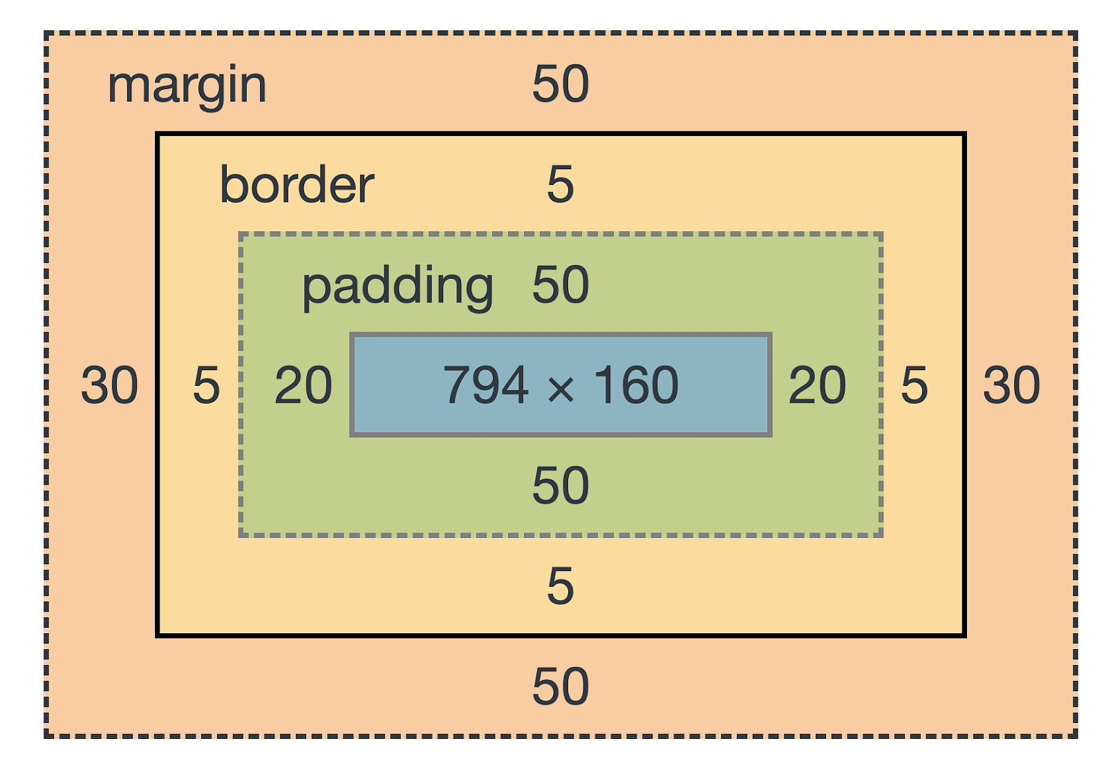
| Component | Description | CSS Properties |
|---|
| Content | The actual content (text, images) | width, height |
| Padding | Space between content and border | padding-top, padding-right, padding-bottom, padding-left, padding |
| Border | Boundary around padding | border-width, border-style, border-color, border |
| Margin | Space outside the border | margin-top, margin-right, margin-bottom, margin-left, margin |
div {
  width: 300px;
  height: 200px;

  width: 50%;
  height: 50%;

  min-width: 200px;
  max-width: 800px;
  min-height: 100px;
  max-height: 600px;
}
| Value | Description | Example |
|---|
| content-box | Default - width/height only include content area | width: 300px; (Total: 300px + padding + border) |
| border-box | Width/height include content, padding, and border | width: 300px; (Total: exactly 300px) |
* {
  box-sizing: border-box;
}
div {
  border-top: 1px solid black;
  border-right: 2px dashed red;
  border-bottom: 3px dotted green;
  border-left: 4px double blue;

  border-radius: 10px;

  border-top-left-radius: 5px;
  border-top-right-radius: 10px;
  border-bottom-right-radius: 15px;
  border-bottom-left-radius: 20px;

  border-radius: 50%;
}
When two vertical margins meet, they collapse to the larger of the two margins.
.box1 {
  margin-bottom: 20px;
}

.box2 {
  margin-top: 30px;
}
| Prevention Method | How It Works |
|---|
| Add border/padding | Creates separation between margins |
| Use flexbox/grid | These layouts don't have margin collapse |
| Use inline-block | Inline-block elements don't collapse margins |

| Property | Values | Example |
|---|
| font-family | Family names, generic families | font-family: 'Helvetica Neue', Arial, sans-serif; |
| font-size | px, em, rem, %, vw | font-size: 16px; font-size: 1.2rem; |
| font-weight | normal/400, bold/700, 100-900 | font-weight: bold; font-weight: 600; |
| font-style | normal, italic, oblique | font-style: italic; |
| font-variant | normal, small-caps | font-variant: small-caps; |
| Property | Values | Example |
|---|
| text-align | left, right, center, justify | text-align: center; |
| text-decoration | none, underline, overline, line-through | text-decoration: underline; |
| text-transform | none, uppercase, lowercase, capitalize | text-transform: uppercase; |
| text-indent | length | text-indent: 30px; |
| letter-spacing | normal, length | letter-spacing: 1px; |
| word-spacing | normal, length | word-spacing: 2px; |
Using Google Fonts:
<link
  href="https://fonts.googleapis.com/css2?family=Roboto:wght@400;700&display=swap"
  rel="stylesheet"
/>
body {
  font-family: "Roboto", sans-serif;
}
Using @font-face:
@font-face {
  font-family: "MyCustomFont";
  src: url("fonts/custom-font.woff2") format("woff2"), url("fonts/custom-font.woff")
      format("woff");
  font-weight: normal;
  font-style: normal;
}

body {
  font-family: "MyCustomFont", sans-serif;
}
p {
  line-height: 1.5;
  line-height: 24px;
  line-height: 150%;

  letter-spacing: 1px;

  word-spacing: 2px;
}
h1 {
  text-shadow: 2px 2px 4px rgba(0, 0, 0, 0.5);

  text-shadow: 1px 1px 2px black, 0 0 25px blue, 0 0 5px darkblue;
}
| Format | Syntax | Example | Notes |
|---|
| Color names | color name | color: red; | Limited palette |
| Hexadecimal | #RRGGBB | color: #ff0000; | 6 digits for RGB |
| Hex shorthand | #RGB | color: #f00; | Shorthand when possible |
| Hex with alpha | #RRGGBBAA | color: #ff000080; | 8 digits with alpha |
| RGB | rgb(r, g, b) | color: rgb(255, 0, 0); | Values 0-255 |
| RGBA | rgba(r, g, b, a) | color: rgba(255, 0, 0, 0.5); | Alpha 0-1 |
| HSL | hsl(h, s%, l%) | color: hsl(0, 100%, 50%); | Hue 0-360, S/L 0-100% |
| HSLA | hsla(h, s%, l%, a) | color: hsla(0, 100%, 50%, 0.5); | With alpha 0-1 |
div {
  background-color: #f0f0f0;

  background-image: url("image.jpg");

  background-repeat: repeat;
  background-repeat: no-repeat;
  background-repeat: repeat-x;
  background-repeat: repeat-y;

  background-position: center;
  background-position: top right;
  background-position: 25% 75%;
  background-position: 20px 50px;

  background-size: auto;
  background-size: cover;
  background-size: contain;
  background-size: 50% auto;
  background-size: 200px 100px;

  background-attachment: scroll;
  background-attachment: fixed;
  background-attachment: local;

  background: #f0f0f0 url("image.jpg") no-repeat center/cover fixed;
}
| Gradient Type | Syntax | Example |
|---|
| Linear | linear-gradient(direction, color1, color2, ...) | linear-gradient(to right, red, yellow); |
| Radial | radial-gradient(shape, color1, color2, ...) | radial-gradient(circle, red, yellow); |
| Conic | conic-gradient(color1, color2, ...) | conic-gradient(red, yellow, green, blue); |
| Repeating | repeating-linear-gradient(...) | repeating-linear-gradient(45deg, red, blue 10%); |
div {
  opacity: 0.7;

  background-color: rgba(255, 0, 0, 0.5);

  background-color: rgba(0, 0, 0, 0.7);
  color: white;
}
div {
  background-image: url("foreground.png"), url("middle-ground.png"),
    url("background.png");

  background-position: top left, center, bottom right;

  background-size: auto, 50% auto, cover;

  background-repeat: no-repeat, no-repeat, repeat;
}
| Value | Description | Use Case |
|---|
| block | Full width, new line before and after | Divs, paragraphs, headers |
| inline | Only as wide as content, no line breaks | Spans, anchors, em, strong |
| inline-block | Inline, but can set width/height | Navigation items, buttons |
| none | Removes from layout completely | Hidden elements |
| flex | Flexbox container | Flexible layouts |
| grid | Grid container | Two-dimensional layouts |
div {
  display: block;
  display: inline;
  display: inline-block;
  display: none;
  display: flex;
  display: grid;
  display: table;
  display: contents;

  visibility: hidden;
}
| Value | Description | Offset Properties | Example |
|---|
| static | Default - normal flow | None | position: static; |
| relative | Relative to normal position | top, right, bottom, left | position: relative; top: 10px; |
| absolute | Relative to nearest positioned ancestor | top, right, bottom, left | position: absolute; top: 0; |
| fixed | Relative to viewport | top, right, bottom, left | position: fixed; bottom: 20px; |
| sticky | Relative until scroll threshold, then fixed | top, right, bottom, left | position: sticky; top: 0; |
.float-left {
  float: left;
  margin-right: 15px;
}

.float-right {
  float: right;
  margin-left: 15px;
}

.clear {
  clear: both;
}

.clearfix::after {
  content: "";
  display: table;
  clear: both;
}
.back-layer {
  position: relative;
  z-index: 1;
}

.middle-layer {
  position: relative;
  z-index: 2;
}

.front-layer {
  position: relative;
  z-index: 3;
}
| Value | Description | Example |
|---|
| visible | Content flows outside | overflow: visible; |
| hidden | Clips content | overflow: hidden; |
| scroll | Always shows scrollbars | overflow: scroll; |
| auto | Shows scrollbars when needed | overflow: auto; |
div {
  overflow-x: scroll;
  overflow-y: hidden;

  white-space: nowrap;
  overflow: hidden;
  text-overflow: ellipsis;
}
.container {
  display: flex;
}
| Direction | Main Axis | Cross Axis |
|---|
| row | Horizontal (left to right) | Vertical (top to bottom) |
| row-reverse | Horizontal (right to left) | Vertical (top to bottom) |
| column | Vertical (top to bottom) | Horizontal (left to right) |
| column-reverse | Vertical (bottom to top) | Horizontal (left to right) |
| Property | Values | Description |
|---|
| flex-direction | row, row-reverse, column, column-reverse | Direction of main axis |
| flex-wrap | nowrap, wrap, wrap-reverse | How items wrap |
| justify-content | flex-start, flex-end, center, space-between, space-around, space-evenly | Alignment along main axis |
| align-items | stretch, flex-start, flex-end, center, baseline | Alignment along cross axis |
| align-content | flex-start, flex-end, center, space-between, space-around, stretch | Alignment of wrapped lines |
.container {
  flex-direction: row;
  flex-direction: row-reverse;
  flex-direction: column;
  flex-direction: column-reverse;

  flex-wrap: nowrap;
  flex-wrap: wrap;
  flex-wrap: wrap-reverse;

  flex-flow: column wrap;
}
| Property | Values | Description |
|---|
| flex-grow | number (default 0) | Growth factor |
| flex-shrink | number (default 1) | Shrink factor |
| flex-basis | auto, 0, length, % | Initial size |
| align-self | auto, flex-start, flex-end, center, baseline, stretch | Override container's align-items |
| order | number (default 0) | Controls order of items |
.item {
  flex-grow: 0;
  flex-grow: 1;
  flex-grow: 2;

  flex-shrink: 1;
  flex-shrink: 0;

  flex-basis: auto;
  flex-basis: 0;
  flex-basis: 25%;
  flex-basis: 200px;

  flex: 0 1 auto;
  flex: 1;
  flex: auto;
  flex: none;

  align-self: flex-start;
  align-self: center;
  align-self: flex-end;

  order: -1;
  order: 0;
  order: 1;
}
.container {
  display: grid;
}
| Property | Description | Example |
|---|
| grid-template-columns | Defines columns | grid-template-columns: 100px 200px 100px; |
| grid-template-rows | Defines rows | grid-template-rows: 100px 200px; |
| gap | Sets spacing between cells | gap: 10px; |
.container {
  grid-template-columns: 100px 200px 100px;
  grid-template-columns: 1fr 2fr 1fr;
  grid-template-columns: repeat(3, 1fr);
  grid-template-columns: minmax(100px, 1fr) 2fr;
  grid-template-columns: auto 1fr auto;

  grid-template-rows: 100px 200px;
  grid-template-rows: repeat(3, 100px);
  grid-template-rows: auto;

  column-gap: 20px;
  row-gap: 10px;
  gap: 10px 20px;
  gap: 15px;
}
.container {
  grid-template-areas:
    "header header header"
    "sidebar content content"
    "footer footer footer";

  grid-template-columns: 1fr 3fr 1fr;
  grid-template-rows: auto 1fr auto;
}

.header {
  grid-area: header;
}

.sidebar {
  grid-area: sidebar;
}

.content {
  grid-area: content;
}

.footer {
  grid-area: footer;
}
| Property | Description | Example |
|---|
| grid-column | Column start/end | grid-column: 1 / 3; |
| grid-row | Row start/end | grid-row: 2 / 4; |
| grid-area | Row start / column start / row end / column end | grid-area: 2 / 1 / 4 / 3; |
.item {
  grid-column-start: 1;
  grid-column-end: 3;
  grid-row-start: 2;
  grid-row-end: 4;

  grid-column: 1 / 3;
  grid-row: 2 / 4;

  grid-column: 1 / span 2;
  grid-row: 2 / span 2;

  grid-area: 2 / 1 / 4 / 3;

  grid-area: header;

  justify-self: start;
  justify-self: center;
  justify-self: end;
  justify-self: stretch;

  align-self: start;
  align-self: center;
  align-self: end;
  align-self: stretch;
}
.container {
  grid-template-columns: repeat(auto-fill, minmax(200px, 1fr));

  grid-template-columns: repeat(auto-fit, minmax(200px, 1fr));
}

@media (min-width: 600px) {
  .container {
    grid-template-columns: repeat(2, 1fr);
  }
}

@media (min-width: 900px) {
  .container {
    grid-template-columns: repeat(3, 1fr);
  }
}
@media screen and (max-width: 600px) {
  body {
    font-size: 14px;
  }
}

@media screen and (min-width: 601px) and (max-width: 900px) {
  body {
    font-size: 16px;
  }
}

@media screen {
}
@media print {
}
@media speech {
}
@media all {
}

@media (orientation: landscape) {
}
@media (orientation: portrait) {
}
@media (prefers-color-scheme: dark) {
}
@media (prefers-reduced-motion) {
}
@media (hover: hover) {
}
| Device Category | Breakpoint | Media Query |
|---|
| Small phones | < 576px | @media (max-width: 576px) { } |
| Tablets | 577px - 768px | @media (min-width: 577px) and (max-width: 768px) { } |
| Desktops | 769px - 992px | @media (min-width: 769px) and (max-width: 992px) { } |
| Large desktops | 993px - 1200px | @media (min-width: 993px) and (max-width: 1200px) { } |
| Extra large | > 1200px | @media (min-width: 1201px) { } |
| Unit | Description | Example |
|---|
| vw | 1% of viewport width | width: 50vw; |
| vh | 1% of viewport height | height: 100vh; |
| vmin | 1% of smaller dimension | font-size: 5vmin; |
| vmax | 1% of larger dimension | padding: 3vmax; |
div {
  width: 50vw;
  height: 100vh;
  margin-top: 10vh;
  font-size: 5vmin;
  padding: 3vmax;

  width: calc(100vw - 20px);
}
img {
  max-width: 100%;
  height: auto;

  object-fit: cover;
  object-fit: contain;
  object-position: center;
}

div {
  background-image: url("image.jpg");
  background-size: cover;
  background-position: center;
}
.container {
  padding: 10px;
}

@media (min-width: 768px) {
  .container {
    padding: 20px;
    display: flex;
  }
}

@media (min-width: 1024px) {
  .container {
    padding: 30px;
    max-width: 1200px;
    margin: 0 auto;
  }
}
| Property | Description | Example |
|---|
| transition-property | Properties to animate | transition-property: background-color; |
| transition-duration | Duration of transition | transition-duration: 0.3s; |
| transition-timing-function | Speed curve | transition-timing-function: ease; |
| transition-delay | Delay before starting | transition-delay: 0.1s; |
button {
  background-color: blue;
  color: white;
  padding: 10px 20px;

  transition-property: background-color, transform;
  transition-duration: 0.3s;
  transition-timing-function: ease;
  transition-delay: 0s;

  transition: background-color 0.3s ease, transform 0.3s ease-in-out 0.1s;
}

button:hover {
  background-color: darkblue;
  transform: scale(1.1);
}
| Function | Description | Visual Representation |
|---|
| ease | Start slow, fast, end slow | ⟿ |
| linear | Constant speed | ⟼ |
| ease-in | Start slow | ⟾ |
| ease-out | End slow | ⟿ |
| ease-in-out | Start and end slow | ⟿⟾ |
div {
  transition-timing-function: ease;
  transition-timing-function: linear;
  transition-timing-function: ease-in;
  transition-timing-function: ease-out;
  transition-timing-function: ease-in-out;

  transition-timing-function: cubic-bezier(0.25, 0.1, 0.25, 1);

  transition-timing-function: steps(4, end);
}
@keyframes slide-in {
  0% {
    transform: translateX(-100%);
    opacity: 0;
  }

  60% {
    transform: translateX(10%);
  }

  100% {
    transform: translateX(0);
    opacity: 1;
  }
}

@keyframes fade {
  from {
    opacity: 0;
  }
  to {
    opacity: 1;
  }
}
| Property | Description | Example |
|---|
| animation-name | Name of the keyframe | animation-name: slide-in; |
| animation-duration | Duration of animation | animation-duration: 1s; |
| animation-timing-function | Speed curve | animation-timing-function: ease-out; |
| animation-delay | Delay before starting | animation-delay: 0.5s; |
| animation-iteration-count | How many times | animation-iteration-count: infinite; |
| animation-direction | Direction of play | animation-direction: alternate; |
| animation-fill-mode | Before/after states | animation-fill-mode: forwards; |
.element {
  animation-name: slide-in;
  animation-duration: 1s;
  animation-timing-function: ease-out;
  animation-delay: 0.5s;
  animation-iteration-count: 1;
  animation-direction: normal;
  animation-fill-mode: forwards;
  animation-play-state: running;

  animation: slide-in 1s ease-out 0.5s 1 normal forwards;

  animation: slide-in 1s ease-out, fade 2s linear;
}

.element:hover {
  animation-play-state: paused;
}
:root {
  --primary-color: #3498db;
  --secondary-color: #2ecc71;
  --text-color: #333;
  --spacing-unit: 8px;
  --max-width: 1200px;
  --border-radius: 4px;
}

.button {
  background-color: var(--primary-color);
  color: white;
  padding: calc(var(--spacing-unit) * 2) var(--spacing-unit);
  border-radius: var(--border-radius);
}

.container {
  max-width: var(--container-width, 800px);
}
:root {
  --base-font-size: 16px;
}

.card {
  --card-padding: 15px;
  --card-bg: white;

  padding: var(--card-padding);
  background-color: var(--card-bg);
}

.dark-card {
  --card-bg: #333;
  color: white;
}
:root {
  --bg-color: #ffffff;
  --text-color: #333333;
  --accent-color: #3498db;
}

[data-theme="dark"] {
  --bg-color: #222222;
  --text-color: #f0f0f0;
  --accent-color: #5dade2;
}

body {
  background-color: var(--bg-color);
  color: var(--text-color);
}

button {
  background-color: var(--accent-color);
}
| Framework | Size | Approach | Learning Curve | Best For |
|---|
| Bootstrap | Large | Component-based | Low | Rapid prototyping |
| Tailwind CSS | Small to Large | Utility-first | Medium | Custom designs |
| Bulma | Medium | Component-based | Low | Clean, readable code |
| Foundation | Large | Component-based | Medium | Enterprise applications |
| Materialize | Medium | Material Design | Low | Google-like UI |
.circle {
  width: 200px;
  height: 200px;
  border-radius: 50%;
  background: red;
}

.triangle {
  width: 0;
  height: 0;
  border-left: 50px solid transparent;
  border-right: 50px solid transparent;
  border-bottom: 100px solid blue;
}

.float-circle {
  float: left;
  width: 200px;
  height: 200px;
  shape-outside: circle(50%);
}

.clipped {
  clip-path: polygon(50% 0%, 100% 25%, 100% 75%, 50% 100%, 0% 75%, 0% 25%);
}

.complex-clip {
  clip-path: url(#myClipPath);
}
.content {
  column-count: 3;

  column-width: 300px;

  column-gap: 40px;

  column-rule: 1px solid #ccc;

  .no-break {
    break-inside: avoid;
  }

  .span-all {
    column-span: all;
  }
}
| Filter | Description | Example |
|---|
| grayscale | Converts to grayscale | filter: grayscale(100%); |
| blur | Blurs the element | filter: blur(5px); |
| brightness | Adjusts brightness | filter: brightness(150%); |
| contrast | Adjusts contrast | filter: contrast(200%); |
| hue-rotate | Shifts colors | filter: hue-rotate(90deg); |
| drop-shadow | Adds shadow | filter: drop-shadow(5px 5px 10px black); |
img {
  filter: grayscale(100%);
  filter: blur(5px);
  filter: brightness(150%);
  filter: contrast(200%);
  filter: hue-rotate(90deg);
  filter: invert(100%);
  filter: opacity(50%);
  filter: saturate(200%);
  filter: sepia(100%);

  filter: drop-shadow(5px 5px 10px black);

  filter: contrast(150%) brightness(120%) sepia(30%);
}

.svg-filter {
  filter: url(#myFilter);
}
.masked-element {
  mask-image: url("mask.png");
  mask-size: cover;

  mask-image: linear-gradient(to right, transparent, black);

  -webkit-mask-image: url("mask.svg");
  -webkit-mask-size: contain;
  -webkit-mask-position: center;
  -webkit-mask-repeat: no-repeat;

  mask-image: url("mask1.svg"), linear-gradient(to right, transparent, black);
  mask-size: cover, cover;
  mask-position: center, center;
  mask-composite: add;
}
@media print {
  header,
  footer,
  nav,
  .sidebar {
    display: none !important;
  }

  body {
    -webkit-print-color-adjust: exact;
    color-adjust: exact;
    background-color: white;
    color: black;
    margin: 0;
    padding: 15mm;
  }

  h2 {
    break-before: always;
  }

  table {
    break-inside: avoid;
  }

  a {
    color: black;
    text-decoration: none;
  }

  a::after {
    content: " (" attr(href) ")";
    font-size: 90%;
  }

  body {
    font-size: 12pt;
  }

  h1 {
    font-size: 18pt;
  }
}
| Component | Syntax | Example |
|---|
| Block | .block | .card |
| Element | .block__element | .card__title |
| Modifier | .block--modifier, .block__element--modifier | .card--featured, .card__title--large |
.card {
  background: white;
  border-radius: 4px;
}

.card__title {
  font-size: 1.5em;
  margin-top: 0;
}

.card__image {
  width: 100%;
}

.card__body {
  padding: 15px;
}

.card--featured {
  box-shadow: 0 10px 20px rgba(0, 0, 0, 0.2);
}

.card__title--large {
  font-size: 2em;
}
| Category | Purpose | Prefix | Example |
|---|
| Base | Element defaults | none | body, a |
| Layout | Major layout components | l- | .l-container |
| Module | Reusable components | none | .card, .btn |
| State | States of modules | is- | .is-active |
| Theme | Visual themes | theme- | .theme-dark |
body {
  font-family: Arial, sans-serif;
  line-height: 1.6;
}

a {
  color: #0066cc;
  text-decoration: none;
}

.l-container {
  max-width: 1200px;
  margin: 0 auto;
}

.l-grid {
  display: grid;
  grid-template-columns: repeat(12, 1fr);
  gap: 20px;
}

.btn {
  display: inline-block;
  padding: 10px 15px;
  border-radius: 4px;
  background: #333;
  color: white;
}

.card {
  border: 1px solid #ddd;
  border-radius: 4px;
}

.is-hidden {
  display: none;
}

.is-active {
  background-color: #eee;
  font-weight: bold;
}

.theme-dark {
  background-color: #222;
  color: #eee;
}

.theme-dark .btn {
  background-color: #555;
}
| Issue | Bad Practice | Good Practice |
|---|
| Specificity | body .content #sidebar ul.menu li a.active { } | .menu-link-active { } |
| Expensive Properties | Too many box-shadows, transforms | Use sparingly or with will-change |
| Critical CSS | Loading all CSS at once | Inline critical CSS, defer rest |
.gradient {
  background: -webkit-linear-gradient(left, red, blue);
  background: -moz-linear-gradient(left, red, blue);
  background: -o-linear-gradient(left, red, blue);
  background: linear-gradient(to right, red, blue);
}

.modern-layout {
  display: block;
}

@supports (display: grid) {
  .modern-layout {
    display: grid;
    grid-template-columns: repeat(auto-fill, minmax(200px, 1fr));
  }
}

.button {
  background: linear-gradient(to right, #ff7e5f, #feb47b);
  border-radius: 4px;
  box-shadow: 0 4px 6px rgba(0, 0, 0, 0.1);
  color: white;
}

.no-cssgradients .button {
  background-color: #ff7e5f;
}

.no-borderradius .button {
  border: none;
}
| Technique | Code | Purpose |
|---|
| Outline All Elements | * { outline: 1px solid red !important; } | View element boundaries |
| Background Highlight | * { background: rgba(255, 0, 0, 0.1) !important; } | See element dimensions |
| Empty Element Warnings | div:empty:before { content: "Empty div"; } | Identify empty containers |
* {
  outline: 1px solid red !important;
}

* {
  background: rgba(255, 0, 0, 0.1) !important;
}

div:empty:before {
  content: "Empty div - add content here";
  color: red;
  font-family: monospace;
  background: #ffcccc;
  display: block;
  padding: 10px;
}

[class*="z-"]:hover:before {
  content: attr(class);
  position: absolute;
  top: 0;
  left: 0;
  background: black;
  color: white;
  font-size: 12px;
  padding: 3px 6px;
  z-index: 9999;
}

* {
  overflow: visible !important;
  border: 1px solid red !important;
}